Components
Since the text would be mostly white, we would put the text next to and on different varieties of imagery but we avoid putting the on NORMAL Images for legibility. here are some examples of how we layout our text.

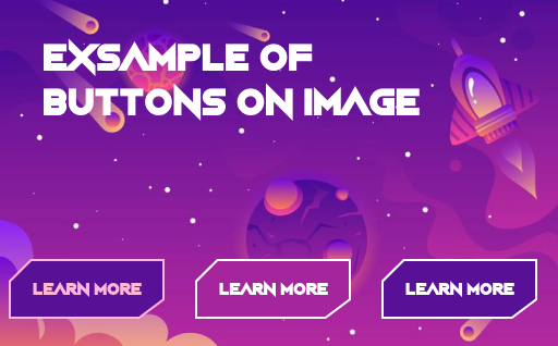
buttons
Buttons must come with bright outlines, the “Night Machine” font and must have a color matching the color of the image to complement the appearance of the website

icons
icons must be small and white to be user friendly and clickable form a far distance
Exsample of final look:
