Oak Harbor Music Festival – Project 2
Process Book Presentation
By Tiffany Linares Vasquez · Web Design GRA-2141C
Client Brief
My client is the Oak Harbor Music Festival, a free annual event held in Oak Harbor, Washington. This festival is known for featuring live music with a variety of musical genres, including rock, blues, country, jazz, and pop. Additionally, the festival supports local artists and offers scholarships for music students. The organization is known for being community-oriented, accessible, and focused on local culture.
Who are your client's competitors?
→ Bumbershoot Music Festival (Seattle, WA)
Website: https://bumbershoot.com
→ Port Townsend Acoustic Blues Festival (Port Townsend, WA)
Website: https://centrum.org/port-townsend-acoustic-blues-festival
How does your client compare to competitors?
Unlike its competitors, the Oak Harbor Music Festival is a 100% free event and is more focused on the local and regional community, providing opportunities for emerging musicians and allowing the community to participate at no cost. Bumbershoot is a large and paid festival, more commercial, while the Port Townsend Blues Festival has a more limited focus in terms of musical genre. Oak Harbor offers greater variety and a family-friendly atmosphere.
Who is your client's target audience?
→ Local families – They are looking for a free and entertaining event to spend the day.
→ Tourists and visitors to the region – People who visit Oak Harbor and are looking for an outdoor cultural event.
→ Lovers of emerging music – Audience looking to discover new bands and support independent artists.
What are the design goals of your client’s website?
→ Modernize the festival's image.
→ Make the main information (dates, location, artists, schedules) clear and accessible.
→ Improve the user experience and navigation.
→ Show attractive visual content: photos and videos of the event.
→ Encourage the participation of volunteers, sponsors, and donations.
What are your client's goals of this project?
→ Increase the visibility of the festival.
→ Facilitate access to information for attendees, volunteers, and sponsors.
→ Reinforce the visual identity of the festival.
→ Create a modern and functional digital experience that reflects the energy and community of the festival.
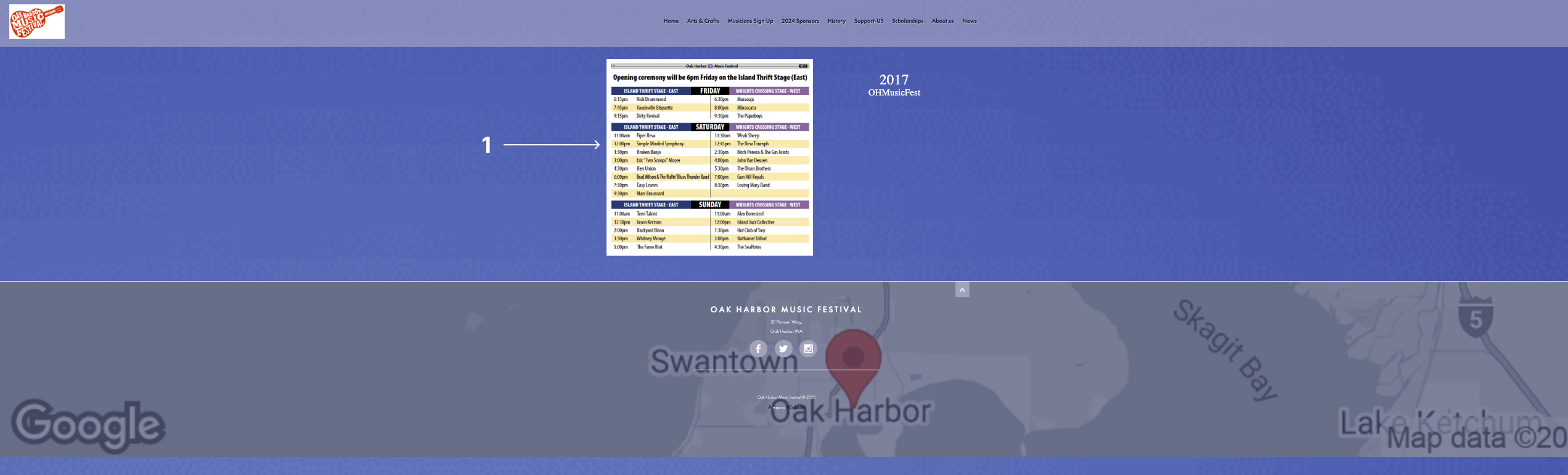
Site Analysis – Homepage
Page 1: Homepage
(https://www.oakharborfestival.com/home)
Analysis:
1. Cluttered header: The logo is small and doesn't stand out. The navigation menu is not clear and has many options that could be grouped.
2. Main information not highlighted: The date and location of the festival are not the first things you see. The visitor must look for the most important information.
3. Low-quality images: The images are neither optimized nor updated, which affects the visual presentation.
4. Inconsistent typography: There are many different text styles that do not maintain a clear visual hierarchy.
5. Empty spaces: There is a lot of wasted space, and the overall structure looks outdated.
What's working:
• The integration of social media and the donation button are accessible.
• The content is complete, but it needs better visual organization.
Site Analysis – Music Lineup Page
Subpage: Music Lineup Page
(https://www.oakharborfestival.com/music-lineup)
Analysis:
1. Lack of clear structure: The list of artists is long and difficult to scan. There are no filters or categories.
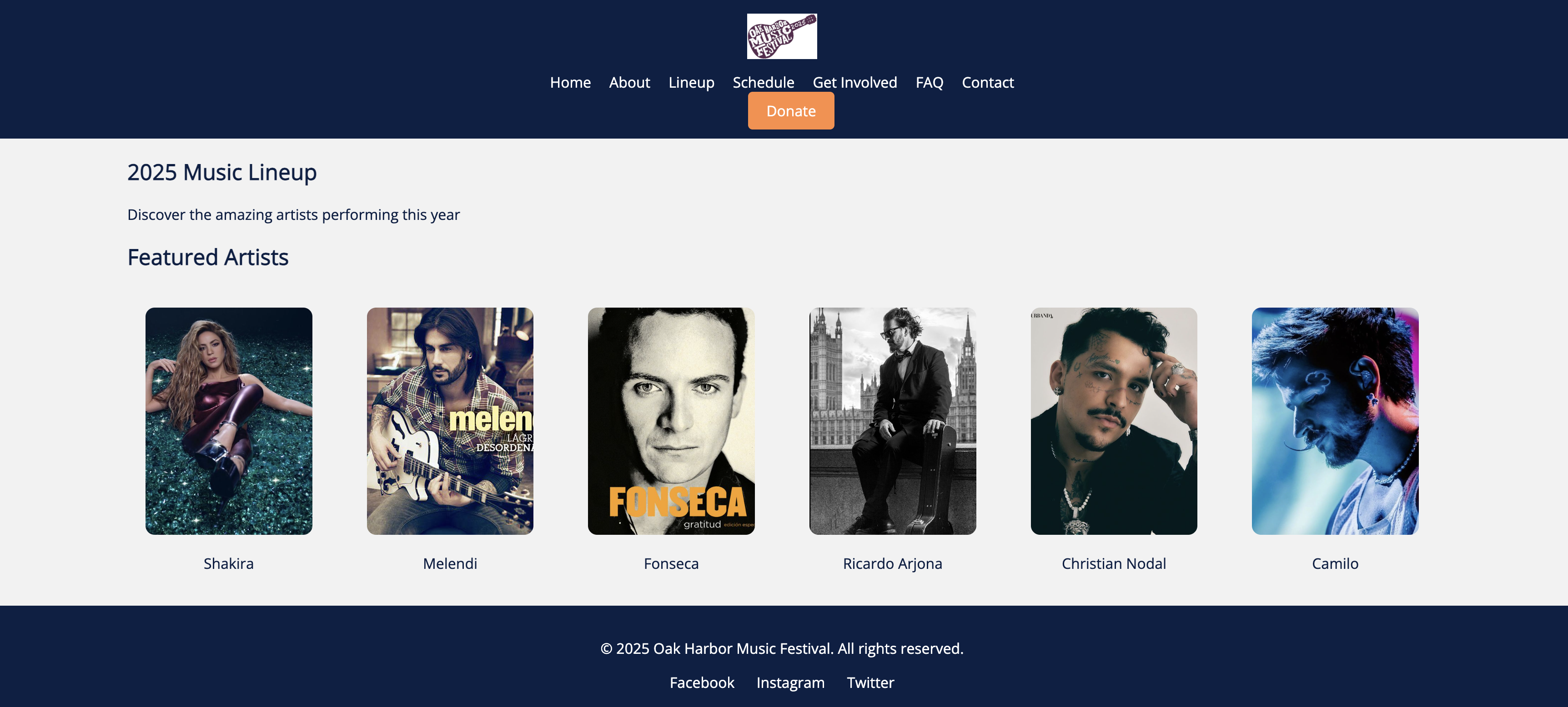
2. Few images of the artists: The content is mostly text. It would be better to include photos or links to listen to the music.
3. Little visual hierarchy: There are no highlighted titles or clear separation between sections.
What's working:
• The list is complete and shows the names of the artists.
• The page loads quickly and is not cluttered.
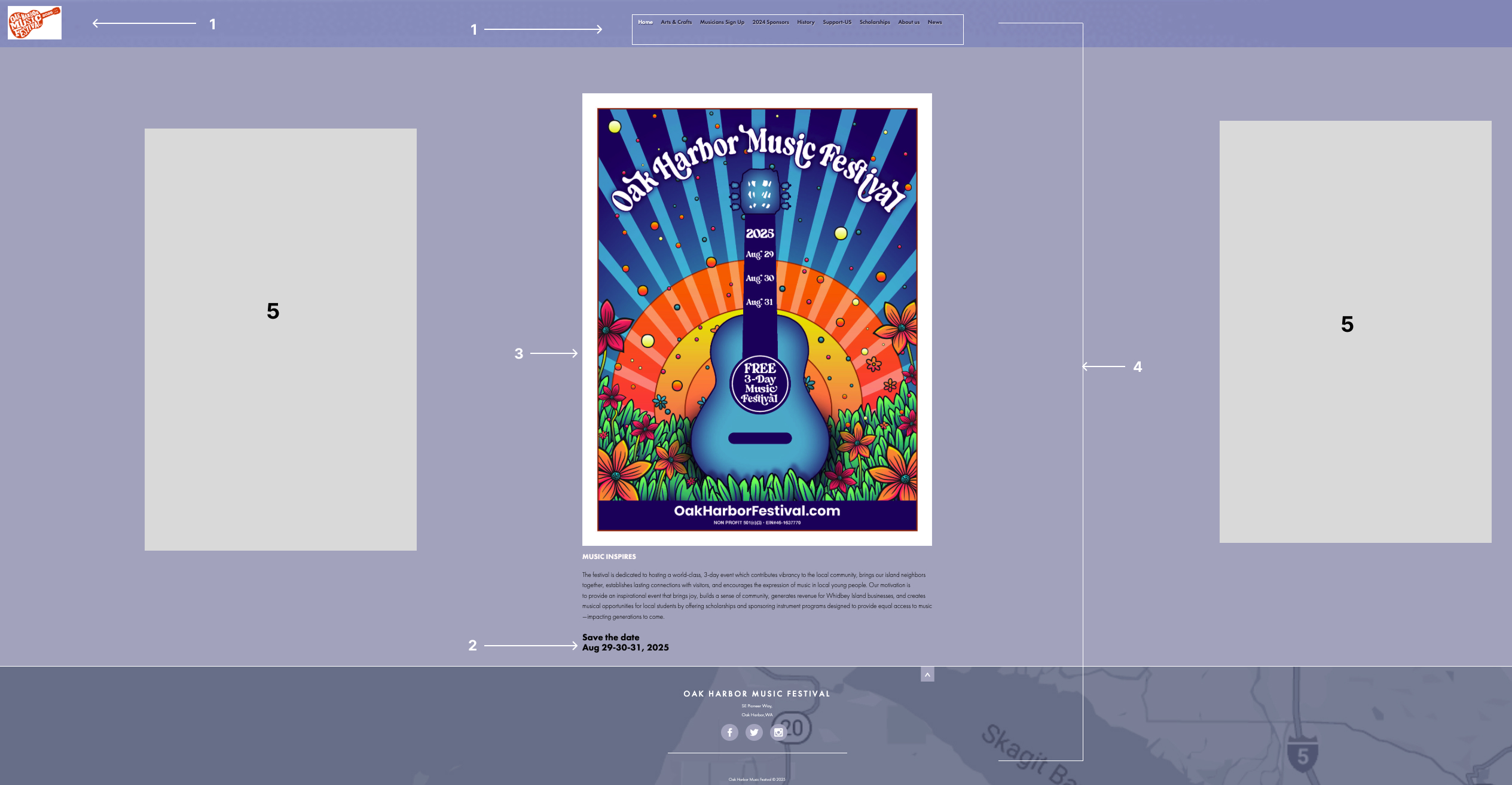
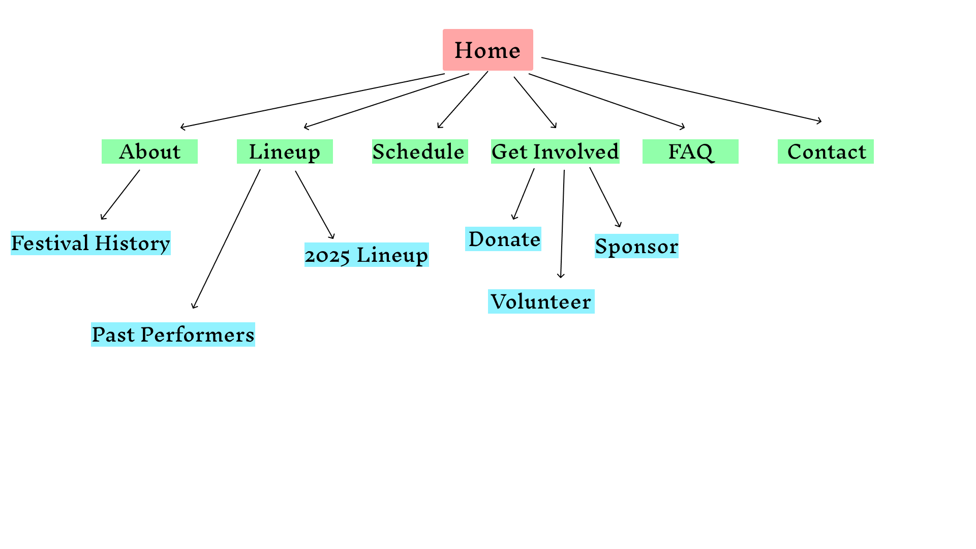
Sitemap
The sitemap shows the planned architecture of the site, grouping content by user needs and simplifying navigation while maintaining all key sections.
Wireframes
The wireframes represent low-fidelity structure of the homepage and a subpage. They were created in grayscale to visualize layout and placement without visual distraction.
Design Inspiration
1. Coachella Website – https://coachella.com
I am inspired by the clean structure and the way they highlight the main information (dates, line-up, location) at first glance.
2. Bumbershoot Festival Website – https://bumbershoot.com
I like how they combine vibrant colors with simple and visual sections that guide the user.
3. Outside Lands Website – https://www.sfoutsidelands.com
The navigation is modern and clear, and they also use good images of the artists and the audience.
4. Lollapalooza Website – https://www.lollapalooza.com
Their use of illustrations, icons, and movement makes the site feel dynamic and youthful.
5. Primavera Sound Website – https://www.primaverasound.com
The color contrast and clean fonts give a professional and contemporary look.
I attached my mood board since it gave me an error while I tried to add it here.
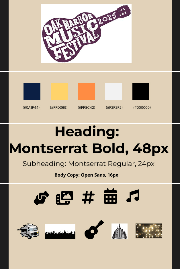
Mood Board
This mood board includes the current and updated logo with the correct year, a palette of 5 core colors, typography study (Montserrat and Open Sans), and 10 assets like photos, icons, and background textures that reflect the event's vibrant atmosphere.
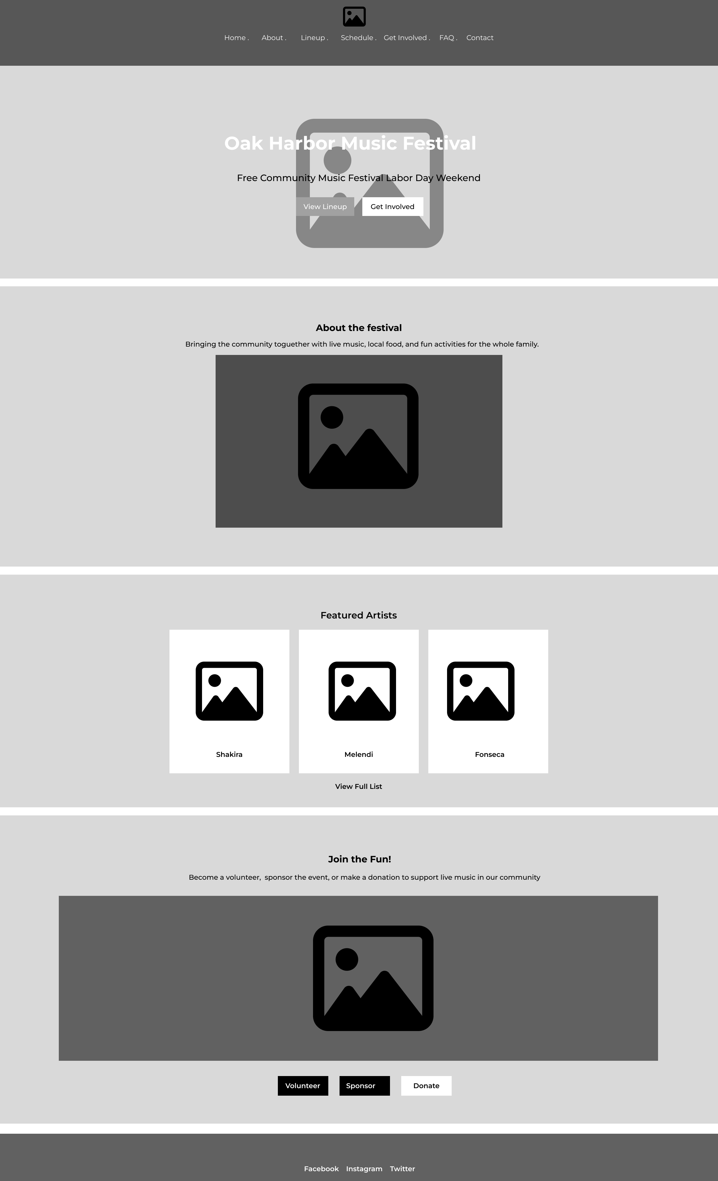
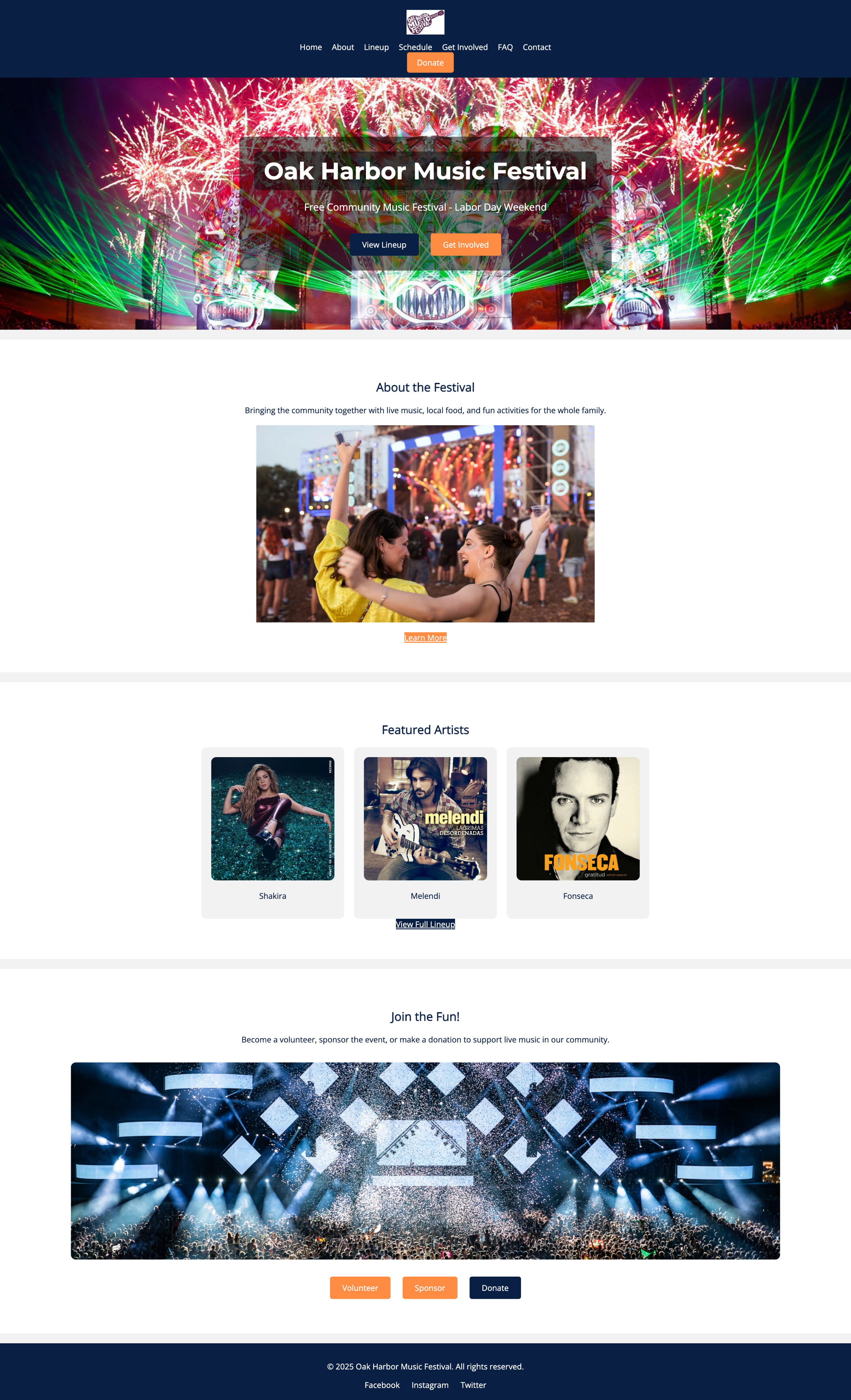
Homepage Comp
The final homepage comp reflects a modern, colorful, and inviting design, placing emphasis on artist promotion, event info, and community involvement. It responds to earlier feedback on image quality, layout balance, and accessibility.
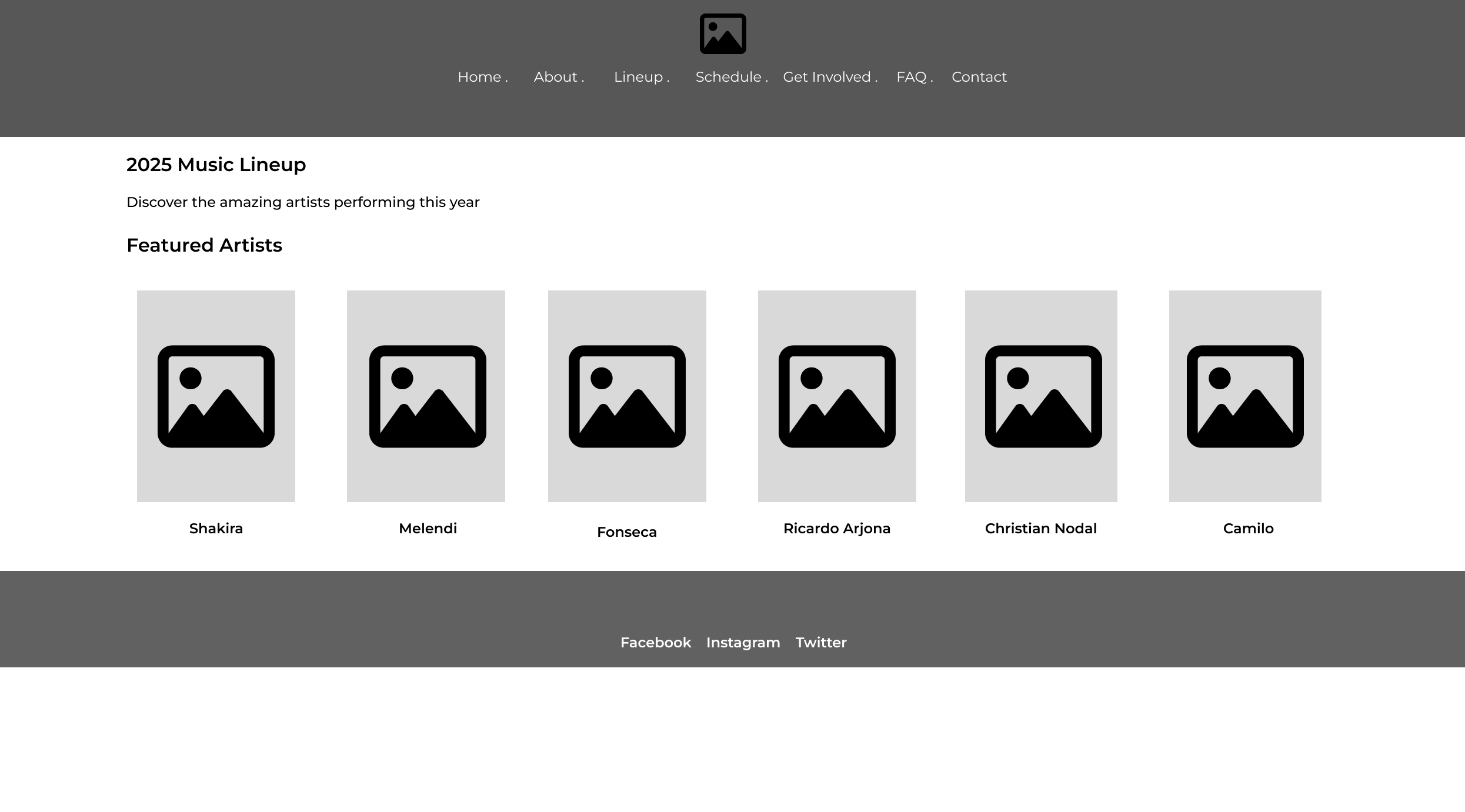
Secondary Page Comp – Lineup
This subpage comp focuses on artist visibility, with consistent layout and imagery. It solves the original page's issues by organizing content into clear cards with artist photos, improving user experience.